

Soda! Product Design


Soda! is a fictitious soda brand that specializes in strange and unique soda flavors. I aimed to design both the product packaging as well as a display stand in a way that captured the fun and creative nature of the brand.
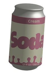
I created each label to be bold, eye catching, and fun. By using vibrant colors and quirky graphics I wanted to capture the essence of each truly unique flavor.
The display stand complements the packaging of the products by incorporating elements of each flavors' design into their respective spaces. I wanted to create an experience that invited potential customers into the weird and exciting world of Soda!, their new favorite beverage product.


To create this project I started with brainstorming ides for the flavors. While the final designs included three flavors, there were many other options like "Berry?", "Celery Stalk", and "Spruce". I wanted to use these flavors to inform my designs. Next I sketched out some possible ideas for the product. I tested possible can designs, colors, and text.


After receiving feedback on the potential designs I got to work creating the labels for the products. I used bold fonts and colors to match this brands bold and innovative outlook on soda. I used fun and bright graphics to help push the sense of whimsy someone would expect from a unique brand like Soda!.
I then used 3D modeling to see what the logos would look like on an actual can. This helped me get a sense of what these products would look like on a display. Using that information as well as feedback I received on the label designs, I began working on the display for the products. I wanted to create an environment for the cans that felt just as fun as the products themselves. I took elements from the labels and incorporated them into the respective shelves. Using those same bold and eye catching colors, I designed each shelf to match the flavor is was selling.